> ## Documentation Index
> Fetch the complete documentation index at: https://documentation.onesignal.com/llms.txt
> Use this file to discover all available pages before exploring further.

# Design in-app messages with HTML

> Design and customize in‑app messages using OneSignal's HTML Editor for maximum flexibility, responsiveness, and branding.

## Overview

OneSignal offers two in-app message editors:

* [Drag & Drop](./design-your-in-app-message) GUI for non‑technical creators
* HTML Editor for developers who want pixel‑perfect control over layout, behavior, and responsiveness.

<Frame caption="Image illustrating code in-app code beside a rendered in-app">
  <img src="https://mintcdn.com/onesignal/Xl2NHJvxakrK4JbL/images/docs/f33b4e3-iam-html-2.png?fit=max&auto=format&n=Xl2NHJvxakrK4JbL&q=85&s=0a0527678d2d094109186fea726918be" width="1700" height="1000" data-path="images/docs/f33b4e3-iam-html-2.png" />
</Frame>

**What you can do with the HTML Editor:**

* **Layouts:** Build complex responsive layouts (e.g., side‑by‑side CTAs).
* **Forms:** Collect inputs inline (email, feedback, survey).
* **Fonts & Brand:** Use custom web fonts and CSS variables.
* **JS Actions:** Track clicks, tag users, send outcomes, and more.

### Requirements

* **iOS:** 3.9.0+
* **Android:** 4.6.3+
  * If your app uses an older SDK, in-app messages will render in a Center Modal layout instead.

***

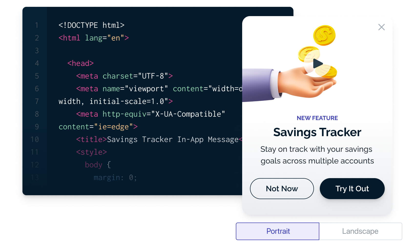
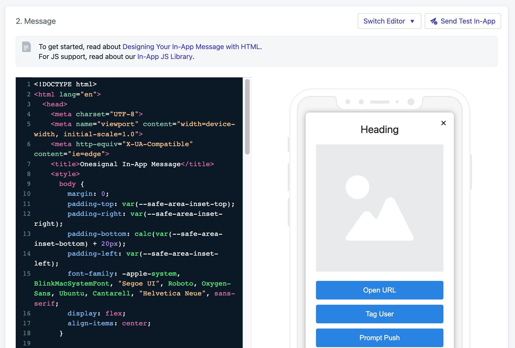
## Create & preview an HTML In‑App

Go to **Messages > New In-App** to create, edit, test, pause, duplicate, or delete your in-app messages.

<Columns cols={2}>
  <Card title="HTML Templates" href="./in-app-html-templates" arrow={true}>
    Start quickly with pre-built templates.
  </Card>

  <Card title="In-app JavaScript Library" href="./in-app-message-api" arrow={true}>
    Use our JavaScript library to track interactions and trigger in-app behaviors.
  </Card>
</Columns>

Enter your HTML code on the left-hand side and preview it live. Use **Send Test In-App** to test responsiveness and design.

<Frame caption="Image showing the HTML Editor beside the preview">
  <img src="https://mintcdn.com/onesignal/6v_cVPknFpo5qSVB/images/docs/04df3a9-Screenshot_2023-04-15_at_11.54.11_AM.png?fit=max&auto=format&n=6v_cVPknFpo5qSVB&q=85&s=db3ac070e794e0c594850a61b2f95927" width="1770" height="1198" data-path="images/docs/04df3a9-Screenshot_2023-04-15_at_11.54.11_AM.png" />
</Frame>

### Add trackable labels

Add `data-onesignal-unique-label` on interactive elements so clicks are tracked and actionable.

```html theme={null}
<button class="tag-user" data-onesignal-unique-label="my-tag-user-button">Tag User</button>
```

### Bind click actions with JavaScript

```js theme={null}
// Tag the user when they click a button
document.querySelector(".tag-user").onclick = (e) => {
  OneSignalIamApi.tagUser(e, { fiz: "baz" });
};
```

<Note>
  Learn more in the [In-App JS Library documentation](./in-app-message-api).
</Note>

### Asset support

Assets load at render time from the URLs you provide.

```html theme={null}
<img src="https://media.onesignal.com/iam/default_image_20200320.png" alt="Promo" />
```

### Personalization

Dynamically insert user data values [using Liquid syntax](./using-liquid-syntax):

```html theme={null}
<div>Hi there {{ name | default: 'you' }}!</div>
```

**Supported contexts:**

* Text inside elements like `div`, `p`, `li`
* Inside `<style>` blocks
* In attributes `href`, `src`, `action`, and `data`

**Not supported in:**

* Inside `<script>` tags
* Across complex nested content where parsing becomes ambiguous e.g.:

```html theme={null}
<div>
  Hi {{name}}
  <span>Here's your coupon!</span>
</div>
```

***

## Accessibility & responsive design

Use CSS media queries and platform typography to adapt to device size and OS text settings.

```css theme={null}
@media only screen and (max-width: 620px) {
  .btn-primary { width: 100% !important; }
}
/* Respect dynamic text sizes on iOS */
:root { font: -apple-system-body; }
```

### Safe areas (notches, home bars)

Modern devices have safe areas (like notches or home bars). Use `safe-area-inset-*` variables to pad your layout:

```css theme={null}
body {
  padding-top: var(--safe-area-inset-top);
  padding-right: var(--safe-area-inset-right);
  padding-bottom: calc(var(--safe-area-inset-bottom) + 20px);
  padding-left: var(--safe-area-inset-left);
  margin: 0;
}
```

## Dark mode styling

Mobile devices and apps often apply automatic dark mode adjustments based on the user’s system theme. This can cause in-app messages (IAMs) to appear differently than intended. For example, text may invert color or background images may look dimmed. To ensure your IAM looks consistent across light and dark themes, define explicit styles for both modes.

### Best practices

* **Set explicit colors.** Always define text, background, and button colors directly in your HTML or CSS. Avoid transparent or default colors that rely on system behavior.

* **Use `prefers-color-scheme` media queries.** You can include dark mode overrides with:

  ```css theme={null}
  @media (prefers-color-scheme: dark) {
    body {
      background-color: #000000;
      color: #ffffff;
    }
    .button {
      background-color: #ffffff;
      color: #000000;
    }
  }
  ```

* Optimize images for both modes. Use transparent PNGs or SVGs where possible. For background images, test readability in both light and dark themes.

* Avoid double inversions. Some Android and iOS versions may auto-adjust colors. Using explicit dark mode styles helps prevent your custom dark theme from being inverted again by the OS.

* Preview in both modes. Use your app’s dark and light themes to verify that text, buttons, and backgrounds have enough contrast and remain accessible.

<Note> Test across platforms. Android WebView, iOS WKWebView, and web builds handle dark mode differently. Always preview your in-app message in both themes before publishing. </Note>

***

### Embedding videos

You can embed videos (e.g., YouTube, Vimeo) directly in your in-app messages using `<iframe>`.\
This is useful for demos, promos, or onboarding flows.

Most browsers only allow **autoplay if the video starts muted**, so always include `&mute=1` in the embed URL.

<Note>
  Autoplaying video can impact performance. Keep videos short, and avoid multiple autoplay embeds in a single in-app.
</Note>

#### Example: Autoplay YouTube embed

The snippet below shows how to center a YouTube video in the middle of the in-app with a fixed size (560×315):

```html theme={null}
<!DOCTYPE html>
<html lang="en">
  <head>
    <meta charset="UTF-8" />
    <style>
      body {
        margin: 0;
        height: 100vh;
        display: flex;
        justify-content: center; /* center horizontally */
        align-items: center;     /* center vertically */
        background: #f0f0f0;     /* optional background */
      }
      .video-box {
        width: 560px;  /* fixed width */
        height: 315px; /* fixed height (16:9 ratio) */
        box-shadow: 0 4px 12px rgba(0,0,0,0.2);
        border-radius: 8px;
        overflow: hidden;
        background: #000;
      }
      .video-box iframe {
        width: 100%;
        height: 100%;
        border: none;
      }
    </style>
  </head>
  <body>
    <div class="video-box">
      <iframe src="https://www.youtube.com/embed/bH60T1PZg1c?autoplay=1&mute=1"
        allow="autoplay; encrypted-media"
        allowfullscreen>
      </iframe>
    </div>
  </body>
</html>
```

#### Understanding autoplay behavior

* The embed URL (/embed/VIDEO\_ID) is required for autoplay — normal watch?v= links won’t work.

* Adding ?autoplay=1\&mute=1 ensures the video plays automatically and complies with browser autoplay rules.

* The allow="autoplay; encrypted-media" attribute grants permission for autoplay.

* The .video-box uses a fixed 560×315px size (YouTube’s default 16:9) so the video appears contained instead of stretching full screen.

* The body is set as a flex container with justify-content: center and align-items: center to position the video box in the exact middle of the screen.

***

## Performance tips

* Prefer inline critical CSS; defer heavy scripts.
* Optimize images (dimensioned `<img>` with `object-fit`), use modern formats when possible.
* Keep HTML payloads concise; avoid large base64 blobs.
* Use system fonts or host performant web fonts with `font-display: swap`.
* Reduce file sizes and use proper resolution:
  * [Apple image guidelines](https://developer.apple.com/design/human-interface-guidelines/ios/icons-and-images/image-size-and-resolution/)
  * [Android image overview](https://developer.android.com/guide/topics/graphics)
  * OneSignal has no affiliation with [imagekit.io](https://imagekit.io/), though it’s a helpful tool for optimization.

### Test across devices

Send test messages frequently to confirm behavior and layout across device types. See [Find & set Test Users](./test-users).

***

## FAQ

### Can I remove the gray background or drop shadow from banner-style in-apps?

Yes. For top/bottom banners, update your SDKs and set:

**iOS 5.1.5+**

```xml theme={null}
<key>OneSignal_in_app_message_hide_drop_shadow</key>
<true/>
<key>OneSignal_in_app_message_hide_gray_overlay</key>
<true/>
```

**Android 5.1.9+**

```xml theme={null}
<meta-data android:name="com.onesignal.inAppMessageHideGrayOverlay" android:value="true"/>
<meta-data android:name="com.onesignal.inAppMessageHideDropShadow" android:value="true"/>
```

### Can I reuse in-app templates from other providers?

Yes. Paste your HTML into the editor and replace analytics/actions with the OneSignal In‑App JS methods.

### I don’t have templates. How do I start?

Use the provided starter template or [browse available templates](./in-app-html-templates). Some HTML/CSS experience is recommended.

### What SDK version is required?

* **iOS:** 3.9.0+
* **Android:** 4.6.3+

Older SDKs will fall back to Center Modal rendering.

### Do in-app messages work offline?

No. Messages require an active internet connection to fetch and render content.

***
