> ## Documentation Index
> Fetch the complete documentation index at: https://documentation.onesignal.com/llms.txt
> Use this file to discover all available pages before exploring further.
# Build a button-driven onboarding carousel
> Create a multi-step onboarding flow using HTML In-App Messages with button navigation and automatic dismissal.
## Overview
This tutorial shows you how to create a **multi-step onboarding carousel** using a single HTML In-App Message. Unlike traditional carousels that rely on swipe gestures, this approach uses **button-driven navigation** and keeps all steps within one message.
**What you'll build:**
* A two-step onboarding flow with images, text, and buttons
* Button navigation (tap "Next" to advance, tap "Get Started" to dismiss)
* Progress indicator dots
* Smooth fade transitions between steps
**Use this approach when you want to:**
* Guide users through a **short onboarding or education flow** (2-5 steps)
* Require users to **explicitly tap a button** to continue (no swipe gestures)
* Keep everything inside **one HTML In-App Message** for simplicity
* Automatically dismiss the message when the flow is complete
This guide uses an HTML In-App Message for full control. You can also [build card-based onboarding flows with the drag-and-drop editor](./design-your-in-app-message#carousels)—those cards are swipable but offer less customization.
***
## Prerequisites
Before you begin, make sure you have:
* An active OneSignal app with In-App Messages enabled
* [Permission to create or edit HTML In-App Messages](./manage-team-members#team-members)
* [Mobile SDK](./mobile-sdk-setup) installed in your mobile app
* Basic understanding of HTML, CSS, and JavaScript
***
## How the multi-step flow works
Before diving into the code, it's important to understand the technical approach. This implementation uses **one HTML In-App Message** that switches between steps by **showing and hiding content**, not by loading multiple separate messages.
The architecture relies on **four core components**:
Each step is wrapped in a `
` with the `card` class and a unique ID:
```html theme={null}
...
...
```
* All cards exist in the DOM simultaneously
* Only one card is visible at a time (controlled by the `active` class)
CSS handles the show/hide logic using opacity and pointer events:
```css theme={null}
.card {
opacity: 0;
pointer-events: none; /* Prevents interaction with hidden cards */
transition: opacity .25s ease;
}
.card.active {
opacity: 1;
pointer-events: auto; /* Allows interaction with visible card */
}
```
**Why this matters:**
* `opacity: 0` hides the card visually but keeps it in the layout
* `pointer-events: none` prevents accidental clicks on hidden cards
* `transition` creates smooth fade effects
The `setActive(i)` function controls which card is visible:
```javascript theme={null}
function setActive(i) {
// Update card visibility
document.getElementById("card-0").className = i === 0 ? "card active" : "card";
document.getElementById("card-1").className = i === 1 ? "card active" : "card";
// Update progress dots
var dots = document.getElementById("dots").children;
dots[0].classList.toggle("active", i === 0);
dots[1].classList.toggle("active", i === 1);
}
```
This function:
* Removes `active` from all cards
* Adds `active` to the target card
* Updates progress indicator dots
Buttons trigger navigation or dismissal:
```javascript theme={null}
// Advance to next step
document.getElementById("next-0").addEventListener("click", function () {
setActive(1);
});
// Dismiss the In-App Message
document.getElementById("done").addEventListener("click", function (e) {
if (window.OneSignalIamApi && OneSignalIamApi.close) {
OneSignalIamApi.close(e);
}
});
```
**Important:** `OneSignalIamApi.close(e)` is the OneSignal SDK method that dismisses the In-App Message from within the HTML.
**Key insight:** This is a **single-page application (SPA)** pattern within an In-App Message. All content is loaded once, and JavaScript manages state changes without reloading.
***
## Step 1: Create a new HTML In-App Message
1. In the OneSignal dashboard, go to **Messages → In-App Messages**
2. Click **New In-App Message**
3. Select **HTML** as the message type
4. Choose **Full Screen** or **Large** layout (recommended for onboarding to maximize visual impact)
5. Continue to the HTML editor
The HTML editor preview may not fully reflect runtime behavior. Always test on a real device or test user to verify animations, button behavior, and the dismiss action.
***
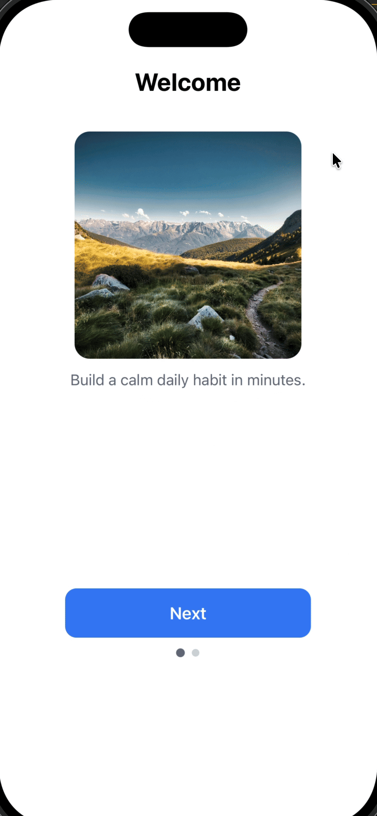
## Step 2: Add the HTML template
Replace the editor contents with the template below. This template includes:
* **Self-contained code:** All HTML, CSS, and JavaScript in one file
* **Button-driven navigation:** No swipe gestures (more reliable across devices)
* **Fade transitions:** Smooth opacity changes between steps
* **OneSignal SDK integration:** Uses `OneSignalIamApi.close(e)` to dismiss the message
* **Mobile-optimized:** Responsive layout with viewport meta tag
```html theme={null}
Welcome
Build a calm daily habit in minutes.
Breathe
Guided breathing whenever you need a reset.
```
***
## Step 3: Customize your content
### Safe to customize
You can modify these elements without breaking functionality:
**Content:**
* Headline text in `
` tags
* Body copy in `
` tags
* Button labels (`Next`, `Get Started`)
* Image URLs in the `background-image: url('...')` styles
**Visual styling:**
* Colors: Change `.btn` background, text color, or dot colors
* Spacing: Adjust padding and margins
* Typography: Modify font-family, font-size, font-weight
* Border radius: Update `border-radius` values for buttons and images
### Adding more steps
To add a third step, follow this pattern:
1. **Add the HTML card:**
```html theme={null}
Your Title
Your description
```
2. **Add a progress dot:**
```html theme={null}
```
3. **Update the `setActive()` function:**
```javascript theme={null}
function setActive(i) {
document.getElementById("card-0").className = i === 0 ? "card active" : "card";
document.getElementById("card-1").className = i === 1 ? "card active" : "card";
document.getElementById("card-2").className = i === 2 ? "card active" : "card"; // New card
var dots = document.getElementById("dots").children;
dots[0].classList.toggle("active", i === 0);
dots[1].classList.toggle("active", i === 1);
dots[2].classList.toggle("active", i === 2); // New dot
}
```
4. **Update the previous step's button ID:**
Change `id="done"` to `id="next-1"` on card 1's button, then add a click listener:
```javascript theme={null}
document.getElementById("next-1").addEventListener("click", function () {
setActive(2);
});
```
5. **Add the dismiss button to the new last card (card-2):**
```javascript theme={null}
document.getElementById("done").addEventListener("click", function (e) {
if (window.OneSignalIamApi && OneSignalIamApi.close) {
OneSignalIamApi.close(e);
}
});
```
Keep onboarding flows short (2-4 steps maximum). Users drop off quickly in longer flows. Test completion rates with [click tracking](./in-app-message-api#click-name).
***
## Step 4: Test the In-App Message
### Testing checklist
1. **Save** the message in the OneSignal dashboard
2. **Configure delivery settings:**
* Set trigger conditions (e.g., session start, specific page view)
* Choose your target audience or select a test user
3. **Send to a test device:**
* Use [Test Users](./test-users) to preview without affecting production users
* Install your app on a physical device (recommended over simulators for accurate behavior)
4. **Verify functionality:**
* ✓ First card appears with correct content
* ✓ "Next" button advances to card 2
* ✓ Progress dots update correctly
* ✓ Fade transitions are smooth
* ✓ "Get Started" button dismisses the message
* ✓ Message doesn't reappear immediately (check frequency capping settings)
Simulators/emulators may not accurately reflect real device behavior, especially for touch interactions and SDK integrations. Always test on physical devices before launching to production.
### Troubleshooting common issues
| Issue | Likely cause | Solution |
| --------------------------------- | -------------------------------- | -------------------------------------------------------------------------------------------- |
| Message doesn't appear | Trigger conditions not met | Check [In-App Message Triggers](./iam-triggers) and verify your test user meets the criteria |
| Buttons don't work | JavaScript errors or ID mismatch | Check browser console for errors; verify button IDs match event listener IDs |
| Images don't load | CORS issues or invalid URLs | Use HTTPS URLs; test image URLs in a browser first |
| Message appears but won't dismiss | OneSignal SDK not loaded | Verify [Mobile SDK setup](./mobile-sdk-setup) is complete |
***
## Next steps
**Track user engagement:**
* Add click tracking using [`data-onesignal-unique-label`](./in-app-message-api#click-name) attributes (already included in the template) to measure drop-off between steps
* View click analytics in **Messages → In-App Messages → \[Your Message] → Analytics**
**Personalize the experience:**
* [Tag users](./in-app-message-api#tag-user) who complete onboarding (e.g., `onboarding_completed: true`)
* Use tags to [segment users](./segmentation) and prevent re-showing the onboarding flow
* [Add user data](./add-user-data-tags) to personalize content in future messages
**Advanced customization:**
* [Deep link](./deep-linking#send-in-app-messages-with-deep-links) users to a specific screen after dismissal
* Use [Liquid syntax](./using-liquid-syntax) to personalize headlines with user names or attributes
* Implement A/B testing with different onboarding flows to optimize completion rates
 **Use this approach when you want to:**
* Guide users through a **short onboarding or education flow** (2-5 steps)
* Require users to **explicitly tap a button** to continue (no swipe gestures)
* Keep everything inside **one HTML In-App Message** for simplicity
* Automatically dismiss the message when the flow is complete
**Use this approach when you want to:**
* Guide users through a **short onboarding or education flow** (2-5 steps)
* Require users to **explicitly tap a button** to continue (no swipe gestures)
* Keep everything inside **one HTML In-App Message** for simplicity
* Automatically dismiss the message when the flow is complete