Prerequisites
- You installed and initialized the OneSignal SDK in your app.
- You’re on recommended SDKs for the latest editor features:
- iOS 5.1.5+
- Android 5.1.9+
- If not uploading images to OneSignal, then your images should be hosted on a fast, publicly accessible URL (CDN recommended) and sized appropriately for mobile screens.
Start from a pre-built template
Pre-built templates help you launch quickly with layouts that are designed for conversion (including permission prompts). Choose a template, then update the copy, colors, and actions to match your brand.Device testing: Pre-built designs have been tested on Pixel 6+, iPhone (iOS 14+), Huawei Nova 9, Huawei P50 Foldable, and iPad (10th gen+). These templates are optimized for portrait orientation and may not display as intended in landscape mode.
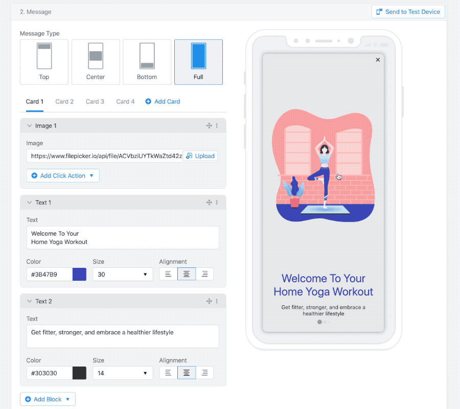
Choose a message layout
Message layout controls how the in-app appears on screen.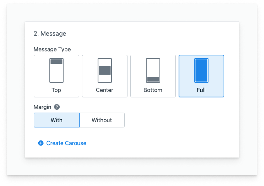
Build multi-screen flows with carousels
Carousels let you create multi-screen in-app experiences like onboarding, feature tours, or multi-step offers.- Select the Full message type.
- Click Create Carousel.
- Add up to 10 cards (screens).
- Customize each card with any combination of blocks.
Orientation support
In-app messages support portrait and landscape, but layouts (especially templates) may need adjustments to look great in both.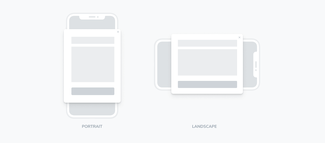
If you expect frequent landscape usage (tablets, games, video apps), test your message in landscape before publishing. Wide layouts often need smaller text sizes, tighter spacing, or fewer stacked blocks.
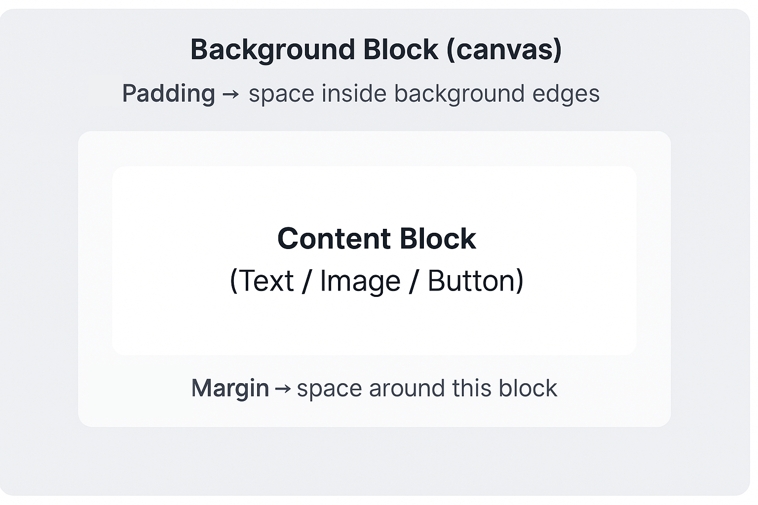
Use blocks and spacing for clean layouts
Everything is placed on the Background block (your canvas). Use:- Padding on the Background for space between your content and the message edges.
- Margin on individual blocks for space between elements (headline → image → button).
- Use Padding to control distance from the message edges.
- Use Margin to separate blocks vertically.
- Avoid stacking large padding and margins on the same side.
- Prefer centered, flow-based layouts over tight/edge-aligned designs.
- Always use Preview on multiple device sizes before publishing.
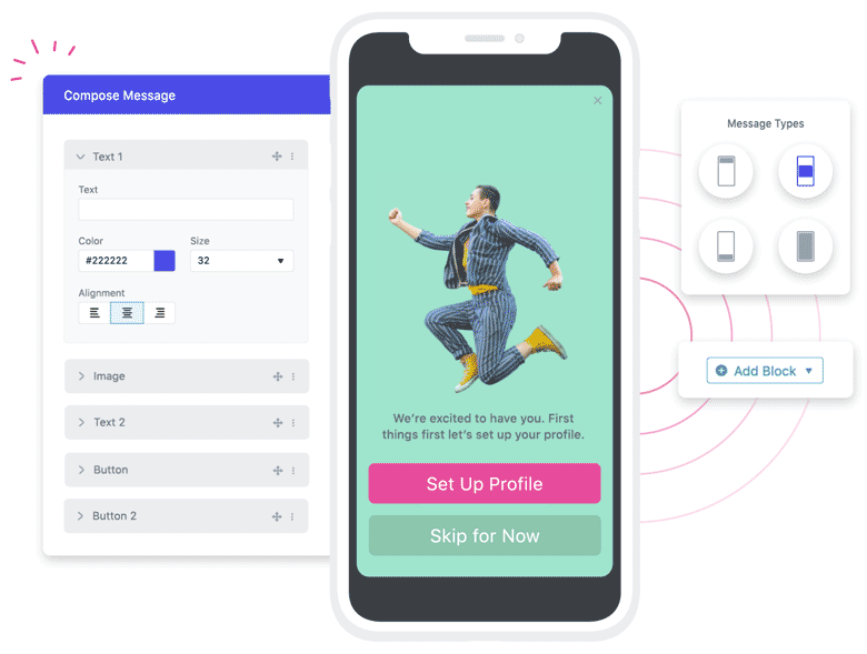
Block reference
Use these blocks to build your message. Each block supports styling and (in most cases) an optional click action.Text block
Use for headlines, descriptions, disclaimers, or personalized copy. What you can customize- Responsive sizing: Width/height in percentages.
- Fonts: Google Fonts.
- Formatting: Bold, italic, underline.
- Color: Hex or RGBA (supports transparency).
- Alignment: Left, center, right.
- Size: Adjustable font size.
- Margins: Space around the block.
- Localize with language-based segments or using Liquid syntax.
- Personalize with Tags.
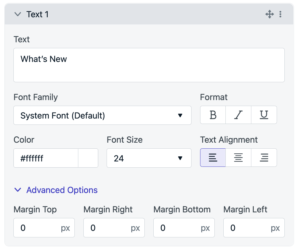
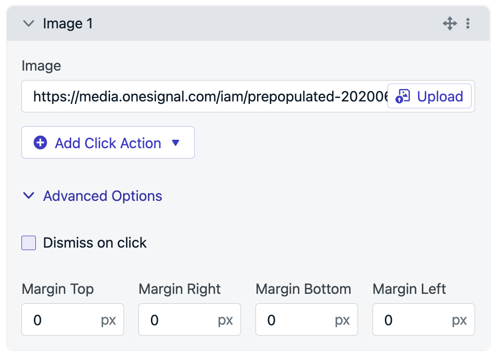
Image block
Use images to reinforce the offer, show a feature, or add branding. Supported formats and limits.jpg,.png,.gif- Maximum file size: 5MB
- Use common aspect ratios like
16:9,4:3, or3:2. - You can dynamically swap links and image URLs using server-hosted paths. See Dynamic URLs.
- Example:
https://example.com/images/{{ tag_key }}.png
- Example:
- Image URL: Hosted is recommended for performance.
- Click action: Optional (link, deep link, tag, outcome, prompt).
- Dismiss on click
- Margins: Space around the block.
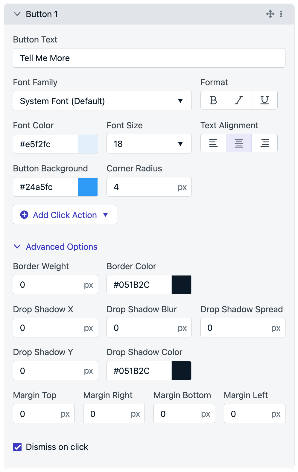
Button block
Use buttons for primary actions like navigation, collecting feedback, or permission prompts. What you can customize- Button text and font styling
- Background color, size, and corner radius
- Optional icon/image
- Click action (tagging, outcomes, prompts, deep links)
- Dismiss on click
- Margins
- Borders and shadows
- Personalize button text or destinations using tags.
- You can make an image-only button by setting the background opacity to 0.
- Use subtle shadows (low opacity, higher blur) to lift the primary CTA.
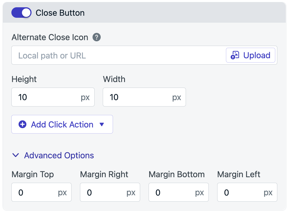
Close button block
The close button controls whether users can dismiss the message using an “X” icon. What you can customize- Enable/disable visibility
- Custom icon (
.jpg,.png,.svg,.gif) - Recommended size:
10x10px - Optional click action
- Margins
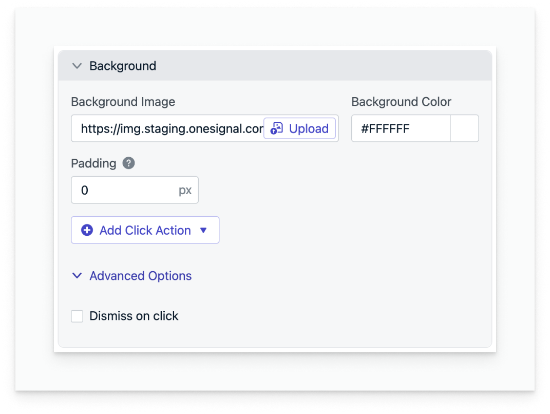
Background block
The background is the canvas that holds your layout. What you can customize- Background color (RGBA supported)
- Background image (
.jpg,.png,.gif) - Optional click action
- Padding (default
24px) - Dismiss on click
Personalization & localization
You can personalize in-app messages using Tags including inside text, button labels, and URLs. For localization, see Multi-langauge messages.A good personalization test is to send the message to a small internal segment with known tag values and confirm:
- The text and images render with the expected substitutions
- Links resolve correctly
- Buttons fire the expected click outcomes/tags
FAQ
Can I remove the gray overlay or drop shadow from top/bottom banner in-apps?
Yes—update your SDKs and add the config below. iOS 5.1.5+iOS Info.plist
Android Manifest.xml
Next steps
- Learn about In-App Click Actions to customize what happens when users click elements in your message.
- Try different In-App Message Triggers to control when messages appear.
- Need more customization? Try Design In-App Messages with HTML.