
Overview

This tutorial shows you how to create a multi-step onboarding carousel using a single HTML In-App Message. Unlike traditional carousels that rely on swipe gestures, this approach uses button-driven navigation and keeps all steps within one message. What you’ll build:
  • A two-step onboarding flow with images, text, and buttons
  • Button navigation (tap “Next” to advance, tap “Get Started” to dismiss)
  • Progress indicator dots
  • Smooth fade transitions between steps
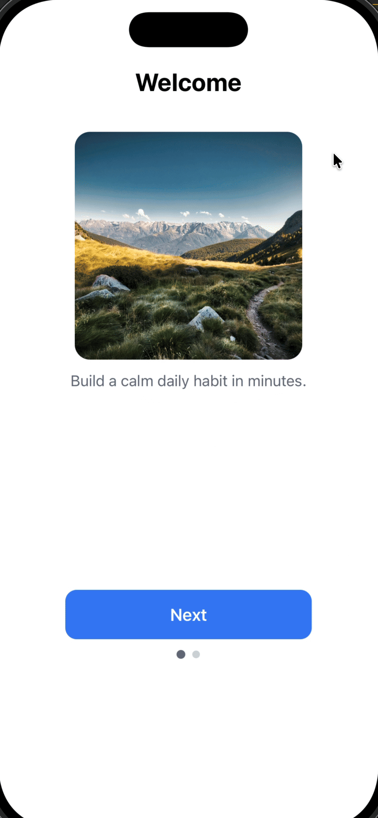
Onboarding carousel showing welcome screen with image, text, and Next button
Use this approach when you want to:
  • Guide users through a short onboarding or education flow (2-5 steps)
  • Require users to explicitly tap a button to continue (no swipe gestures)
  • Keep everything inside one HTML In-App Message for simplicity
  • Automatically dismiss the message when the flow is complete
This guide uses an HTML In-App Message for full control. You can also build card-based onboarding flows with the drag-and-drop editor—those cards are swipable but offer less customization.

Prerequisites

Before you begin, make sure you have:

How the multi-step flow works

Before diving into the code, it’s important to understand the technical approach. This implementation uses one HTML In-App Message that switches between steps by showing and hiding content, not by loading multiple separate messages. The architecture relies on four core components:
1

Card containers for each step

Each step is wrapped in a <div> with the card class and a unique ID:
<div id="card-0" class="card active">...</div>
<div id="card-1" class="card">...</div>
  • All cards exist in the DOM simultaneously
  • Only one card is visible at a time (controlled by the active class)
2

CSS visibility control

CSS handles the show/hide logic using opacity and pointer events:
.card {
  opacity: 0;
  pointer-events: none;  /* Prevents interaction with hidden cards */
  transition: opacity .25s ease;
}

.card.active {
  opacity: 1;
  pointer-events: auto;  /* Allows interaction with visible card */
}
Why this matters:
  • opacity: 0 hides the card visually but keeps it in the layout
  • pointer-events: none prevents accidental clicks on hidden cards
  • transition creates smooth fade effects
3

JavaScript state management

The setActive(i) function controls which card is visible:
function setActive(i) {
  // Update card visibility
  document.getElementById("card-0").className = i === 0 ? "card active" : "card";
  document.getElementById("card-1").className = i === 1 ? "card active" : "card";
  
  // Update progress dots
  var dots = document.getElementById("dots").children;
  dots[0].classList.toggle("active", i === 0);
  dots[1].classList.toggle("active", i === 1);
}
This function:
  • Removes active from all cards
  • Adds active to the target card
  • Updates progress indicator dots
4

Button event listeners

Buttons trigger navigation or dismissal:
// Advance to next step
document.getElementById("next-0").addEventListener("click", function () {
  setActive(1);
});

// Dismiss the In-App Message
document.getElementById("done").addEventListener("click", function (e) {
  if (window.OneSignalIamApi && OneSignalIamApi.close) {
    OneSignalIamApi.close(e);
  }
});
Important: OneSignalIamApi.close(e) is the OneSignal SDK method that dismisses the In-App Message from within the HTML.
Key insight: This is a single-page application (SPA) pattern within an In-App Message. All content is loaded once, and JavaScript manages state changes without reloading.

Step 1: Create a new HTML In-App Message

  1. In the OneSignal dashboard, go to Messages → In-App Messages
  2. Click New In-App Message
  3. Select HTML as the message type
  4. Choose Full Screen or Large layout (recommended for onboarding to maximize visual impact)
  5. Continue to the HTML editor
The HTML editor preview may not fully reflect runtime behavior. Always test on a real device or test user to verify animations, button behavior, and the dismiss action.

Step 2: Add the HTML template

Replace the editor contents with the template below. This template includes:
  • Self-contained code: All HTML, CSS, and JavaScript in one file
  • Button-driven navigation: No swipe gestures (more reliable across devices)
  • Fade transitions: Smooth opacity changes between steps
  • OneSignal SDK integration: Uses OneSignalIamApi.close(e) to dismiss the message
  • Mobile-optimized: Responsive layout with viewport meta tag
<!doctype html>
<html>
<head>
  <meta charset="UTF-8" />
  <!-- viewport-fit=cover ensures safe area coverage on notched devices -->
  <meta name="viewport" content="width=device-width, initial-scale=1, viewport-fit=cover" />
  <style>
    /* Base styles - reset and system font */
    html, body {
      margin: 0;
      padding: 0;
      background: #ffffff;
      font-family: -apple-system, system-ui;
    }

    /* Main container with padding */
    .wrap { 
      padding: 28px 22px 24px; 
    }

    /* Stage container - holds all cards in same position */
    .stage {
      position: relative;
      min-height: 74vh;  /* Ensures enough vertical space */
    }

    /* Card - each step of the onboarding flow */
    .card {
      position: absolute;  /* All cards overlap in same position */
      inset: 0;            /* Full coverage of stage */
      display: flex;
      flex-direction: column;
      align-items: center;
      opacity: 0;               /* Hidden by default */
      pointer-events: none;     /* Prevents clicks when hidden */
      transition: opacity .25s ease;  /* Smooth fade effect */
    }

    /* Active card is visible and interactive */
    .card.active {
      opacity: 1;
      pointer-events: auto;
    }

    /* Typography */
    h1 {
      margin: 44px 0 12px;
      font-size: 26px;
      text-align: center;
    }

    p {
      margin: 0;
      color: #6b7280;
      text-align: center;
      max-width: 260px;
      line-height: 1.35;
    }

    /* Image container - square with rounded corners */
    .image {
      width: 240px;
      height: 240px;
      border-radius: 16px;
      margin: 24px 0 12px;
      background-size: cover;
      background-position: center;
    }

    /* Primary button */
    .btn {
      margin-top: auto;  /* Pushes button to bottom of card */
      width: 100%;
      max-width: 260px;
      height: 52px;
      border: 0;
      border-radius: 12px;
      background: #3b82f6;  /* Blue - customize to match your brand */
      color: #fff;
      font-size: 18px;
      font-weight: 600;
    }

    /* Progress indicator dots */
    .dots {
      display: flex;
      justify-content: center;
      gap: 8px;
      padding: 12px 0 8px;
    }

    .dot {
      width: 8px;
      height: 8px;
      border-radius: 999px;
      background: #d1d5db;  /* Inactive dot color */
    }

    .dot.active {
      background: #6b7280;  /* Active dot color */
      transform: scale(1.15);  /* Slightly larger when active */
    }
  </style>
</head>

<body>
  <div class="wrap">
    <div class="stage">

      <!-- STEP 1: Welcome card (starts visible with "active" class) -->
      <div id="card-0" class="card active">
        <h1>Welcome</h1>
        <div
          class="image"
          style="background-image: url('https://images.pexels.com/photos/6153129/pexels-photo-6153129.jpeg');">
        </div>
        <p>Build a calm daily habit in minutes.</p>
        <button
          id="next-0"
          class="btn"
          data-onesignal-unique-label="onboarding_next_0">
          Next
        </button>
      </div>

      <!-- STEP 2: Breathe card (starts hidden, shown when user taps "Next") -->
      <div id="card-1" class="card">
        <h1>Breathe</h1>
        <div
          class="image"
          style="background-image: url('https://images.pexels.com/photos/417173/pexels-photo-417173.jpeg');">
        </div>
        <p>Guided breathing whenever you need a reset.</p>
        <button
          id="done"
          class="btn"
          data-onesignal-unique-label="onboarding_done">
          Get Started
        </button>
      </div>

    </div>

    <!-- Progress indicator: 2 dots, first one starts active -->
    <div class="dots" id="dots">
      <div class="dot active"></div>
      <div class="dot"></div>
    </div>
  </div>

  <script>
    (function () {
      /**
       * Switch between cards by toggling "active" class
       * @param {number} i - Index of card to show (0 or 1)
       */
      function setActive(i) {
        // Update card visibility
        document.getElementById("card-0").className = i === 0 ? "card active" : "card";
        document.getElementById("card-1").className = i === 1 ? "card active" : "card";

        // Update progress dots
        var dots = document.getElementById("dots").children;
        dots[0].classList.toggle("active", i === 0);
        dots[1].classList.toggle("active", i === 1);
      }

      // Button: Next (card 0 → card 1)
      document.getElementById("next-0").addEventListener("click", function () {
        setActive(1);
      });

      // Button: Get Started (dismisses the In-App Message)
      document.getElementById("done").addEventListener("click", function (e) {
        // Check if OneSignal IAM API is available
        if (window.OneSignalIamApi && OneSignalIamApi.close) {
          OneSignalIamApi.close(e);  // Dismiss the message
        }
      });
    })();
  </script>
</body>
</html>

Step 3: Customize your content

Safe to customize

You can modify these elements without breaking functionality: Content:
  • Headline text in <h1> tags
  • Body copy in <p> tags
  • Button labels (Next, Get Started)
  • Image URLs in the background-image: url('...') styles
Visual styling:
  • Colors: Change .btn background, text color, or dot colors
  • Spacing: Adjust padding and margins
  • Typography: Modify font-family, font-size, font-weight
  • Border radius: Update border-radius values for buttons and images

Adding more steps

To add a third step, follow this pattern:
  1. Add the HTML card:
<div id="card-2" class="card">
  <h1>Your Title</h1>
  <div class="image" style="background-image: url('your-image-url');"></div>
  <p>Your description</p>
  <button id="next-2" class="btn">Next</button>
</div>
  1. Add a progress dot:
<div class="dots" id="dots">
  <div class="dot active"></div>
  <div class="dot"></div>
  <div class="dot"></div> <!-- New dot -->
</div>
  1. Update the setActive() function:
function setActive(i) {
  document.getElementById("card-0").className = i === 0 ? "card active" : "card";
  document.getElementById("card-1").className = i === 1 ? "card active" : "card";
  document.getElementById("card-2").className = i === 2 ? "card active" : "card"; // New card
  
  var dots = document.getElementById("dots").children;
  dots[0].classList.toggle("active", i === 0);
  dots[1].classList.toggle("active", i === 1);
  dots[2].classList.toggle("active", i === 2); // New dot
}
  1. Update the previous step’s button ID: Change id="done" to id="next-1" on card 1’s button, then add a click listener:
document.getElementById("next-1").addEventListener("click", function () {
  setActive(2);
});
  1. Add the dismiss button to the new last card (card-2):
document.getElementById("done").addEventListener("click", function (e) {
  if (window.OneSignalIamApi && OneSignalIamApi.close) {
    OneSignalIamApi.close(e);
  }
});
Keep onboarding flows short (2-4 steps maximum). Users drop off quickly in longer flows. Test completion rates with click tracking.

Step 4: Test the In-App Message

Testing checklist

  1. Save the message in the OneSignal dashboard
  2. Configure delivery settings:
    • Set trigger conditions (e.g., session start, specific page view)
    • Choose your target audience or select a test user
  3. Send to a test device:
    • Use Test Users to preview without affecting production users
    • Install your app on a physical device (recommended over simulators for accurate behavior)
  4. Verify functionality:
    • ✓ First card appears with correct content
    • ✓ “Next” button advances to card 2
    • ✓ Progress dots update correctly
    • ✓ Fade transitions are smooth
    • ✓ “Get Started” button dismisses the message
    • ✓ Message doesn’t reappear immediately (check frequency capping settings)
Simulators/emulators may not accurately reflect real device behavior, especially for touch interactions and SDK integrations. Always test on physical devices before launching to production.

Troubleshooting common issues

IssueLikely causeSolution
Message doesn’t appearTrigger conditions not metCheck In-App Message Triggers and verify your test user meets the criteria
Buttons don’t workJavaScript errors or ID mismatchCheck browser console for errors; verify button IDs match event listener IDs
Images don’t loadCORS issues or invalid URLsUse HTTPS URLs; test image URLs in a browser first
Message appears but won’t dismissOneSignal SDK not loadedVerify Mobile SDK setup is complete

Next steps

Track user engagement:
  • Add click tracking using data-onesignal-unique-label attributes (already included in the template) to measure drop-off between steps
  • View click analytics in Messages → In-App Messages → [Your Message] → Analytics
Personalize the experience:
  • Tag users who complete onboarding (e.g., onboarding_completed: true)
  • Use tags to segment users and prevent re-showing the onboarding flow
  • Add user data to personalize content in future messages
Advanced customization:
  • Deep link users to a specific screen after dismissal
  • Use Liquid syntax to personalize headlines with user names or attributes
  • Implement A/B testing with different onboarding flows to optimize completion rates